I work across a range of development technologies to streamline my own work and my team’s. For this project the objective was to improve post-processing and visualisation of outdoor comfort simulation results, both to cut report turnaround time and, more importantly, to increase client engagement through interactive graphics that work on any mobile device.
The stack: Git and GitHub for version control and team collaboration, Jupyter Notebook for code prototyping, Pandas for data pre-processing, Plotly.js for interactive graphics, Streamlit for the web app, and Heroku for deployment.
DATA PRE-PROCESSING
Before uploading simulation results to the cloud, the raw data needs to be pre-processed and optimised. This step uses Jupyter Notebooks and Pandas to calculate every comfort metric and export to an output file.
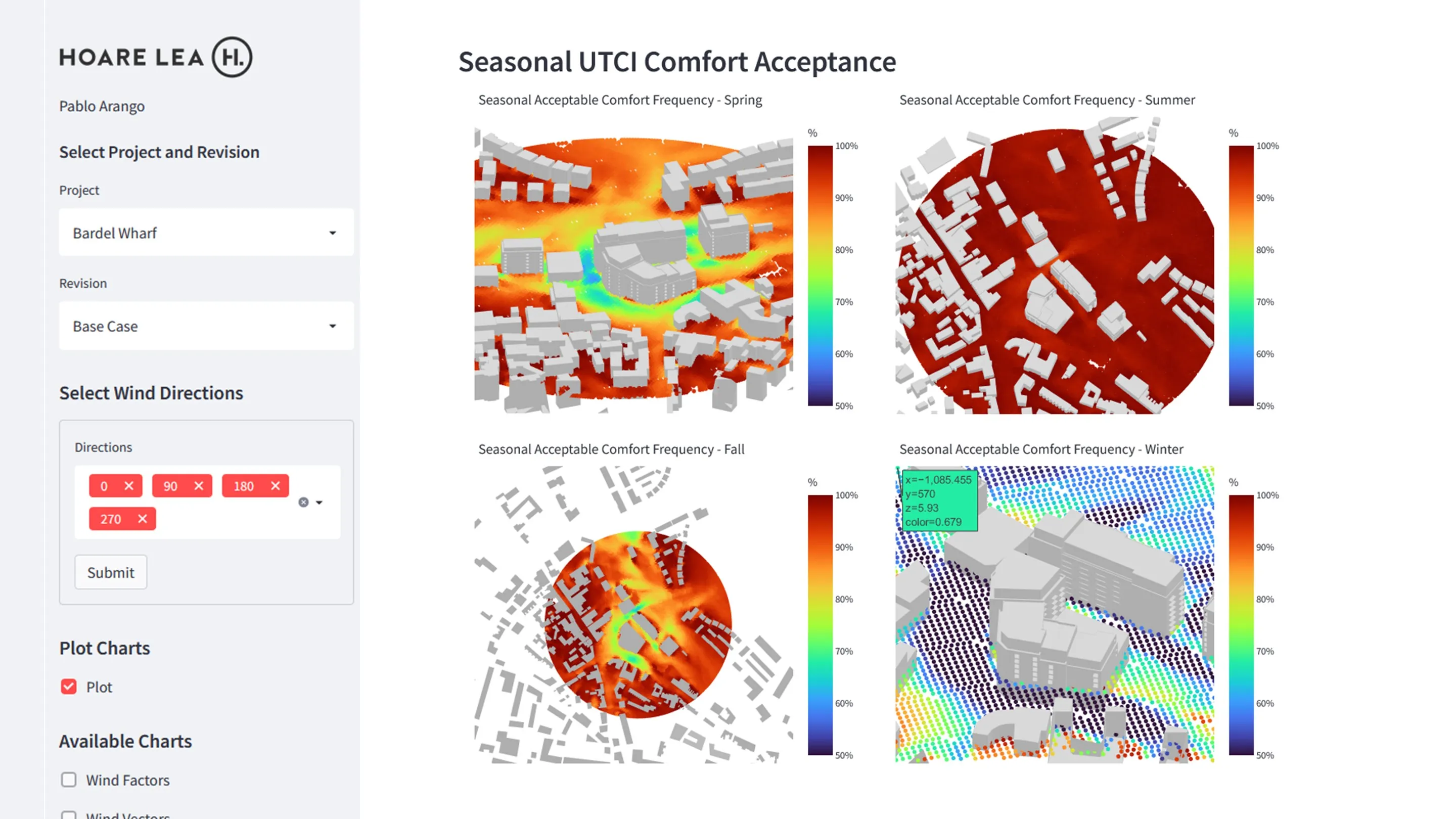
The following output files are generated: (a) wind velocity vectors, (b) wind acceleration factors, (c) seasonal average wind velocity, (d) seasonal percentage of comfort (UTCI), (e) annual UTCI comfort, and (f) Lawson wind comfort metrics.
WEB DEVELOPMENT
Web apps let engineers build tools accessible to anyone, regardless of engineering background. Non-engineers can read advanced building simulation reports through easy-to-understand interactive visualisations.
I chose Streamlit for its ease of use and tight integration with common data science libraries (Pandas, Plotly, NumPy).
ACHIEVEMENTS
- Automated pre-processing of outdoor comfort simulation results and calculation of multiple comfort metrics.
- Deployed to the Hoare Lea Building Physics Team (currently in beta).
- Faster wind comfort reporting for City of London developments.
- Higher client engagement through an interactive, easy-to-use visualisation interface.